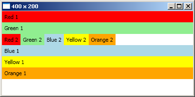
StackPanelPracuje stejně jako ve Windows Forms FlowLayoutPanel. Při vertikálním uspořádání každá položka vyplňuje celou šířku prvku, do kterého náleží. Každý prvek je vysoký přesně tolik jaký je jeho obsah. Výchozí uspořádání je vertikální.
XML<StackPanel orientation="Vertical">
<!-- Vertical is the default -->
<Label background="Red">Red 1</Label>
<Label background="LightGreen">Green 1</Label>
<StackPanel orientation="Horizontal">
<Label background="Red">Red 2</Label>
<Label background="LightGreen">Green 2</Label>
<Label background="LightBlue">Blue 2</Label>
<Label background="Yellow">Yellow 2</Label>
<Label background="Orange">Orange 2</Label>
</StackPanel>
<Label background="LightBlue">Blue 1</Label>
<Label background="Yellow">Yellow 1</Label>
<Label background="Orange">Orange 1</Label>
</StackPanel>
<StackPanel orientation="Vertical">
    <!-- Vertical is the default -->
    <Label background="Red">Red 1</Label>
    <Label background="LightGreen">Green 1</Label>
    <StackPanel orientation="Horizontal">
        <Label background="Red">Red 2</Label>
        <Label background="LightGreen">Green 2</Label>
        <Label background="LightBlue">Blue 2</Label>
        <Label background="Yellow">Yellow 2</Label>
        <Label background="Orange">Orange 2</Label>
    </StackPanel>
    <Label background="LightBlue">Blue 1</Label>
    <Label background="Yellow">Yellow 1</Label>
    <Label background="Orange">Orange 1</Label>
</StackPanel>
WrapPanel
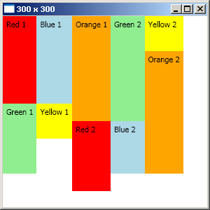
Při vertikálním rozložení se nejdříve obsazuje levá strana a až poté se postupuje k pravé – vždy když se další prvek již nevleze do levé. Analogicky při horizontálním se nejdříve obsazuje horní řada a postupuje se k dolní.
<WrapPanel Orientation="Vertical">
    <Label Height="125" Background="Red">Red 1</Label>
    <Label Height="100" Background="LightGreen">Green 1</Label>
    <Label Height="125" Background="LightBlue">Blue 1</Label>
    <Label Height="50" Background="Yellow">Yellow 1</Label>
    <Label Height="150" Background="Orange">Orange 1</Label>
    <Label Height="100" Background="Red">Red 2</Label>
    <Label Height="150" Background="LightGreen">Green 2</Label>
    <Label Height="75" Background="LightBlue">Blue 2</Label>
    <Label Height="50" Background="Yellow">Yellow 2</Label>
    <Label Height="175" Background="Orange">Orange 2</Label>
</WrapPanel>
DockPanel
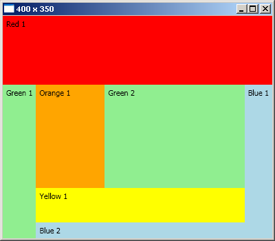
Prvky se skládají zvenku dovnitř. Poslední prvek vyplňuje celou zbývající oblast. Prvky se umisťují do tabu
<DockPanel>
    <Label DockPanel.Dock="Top" Height="100" Background="Red">Red 1</Label>
    <Label DockPanel.Dock="Left" Background="LightGreen">Green 1</Label>
    <Label DockPanel.Dock="Right" Background="LightBlue">Blue 1</Label>
    <Label DockPanel.Dock="Bottom" Background="LightBlue">Blue 2</Label>
    <Label DockPanel.Dock="Bottom" Height="50" Background="Yellow">Yellow 1</Label>
    <Label Width="100" Background="Orange">Orange 1</Label>
    <!-- default is to fill -->
    <Label Background="LightGreen">Green 2</Label>
</DockPanel>
Canvas
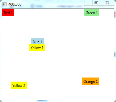
Pro umístění prvku na přesně dané souřadnice. Prvky říkají rodiči kde se mají nacházet pomocí vlastnosti Canvas.Left, dále pak Right, Top, Bottom. Top má větší význam než Bottom, Left má větší význam než Right – toto platí když specifikujete třeba najednou Top i Bottom. Čili se to všechno řídí od bodu 0,0. Když není specifikována velikost, prvek se roztáhne na jeho obsah. Stačí zadat pouze jednu hodnotu Canvas.Smer, ta druhá hodnota se nastaví automaticky na 0. Prvky definované níže překrývají prvky definované výše.
<Canvas>
    <!-- default coordinates 0,0 from top left; like WinForms -->
    <Label Background="Red">Red 1</Label>
    <Label Canvas.Right="50" Background="LightGreen">Green 1</Label>
    <Label Canvas.Top="100" Canvas.Left="100" Background="LightBlue">Blue 1</Label>
    <Label Canvas.Bottom="166" Canvas.Right="237" Background="Yellow">Yellow 1</Label>
    <Label Canvas.Right="300" Canvas.Top="250" Background="Yellow">Yellow 2</Label>
    <Label Canvas.Right="50" Canvas.Bottom="50" Background="Orange">Orange 1</Label>
</Canvas>
UniformGrid
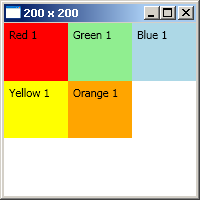
Pokud máte tabulku o stejně velkých řádcích i sloupcích. Čím více prvků to tohoto rodiče přidáte, tím bude každý prvek menší(a i se stejnou velikostí).
<UniformGrid>
    <Label Background="Red">Red 1</Label>
    <Label Background="LightGreen">Green 1</Label>
    <Label Background="LightBlue">Blue 1</Label>
    <Label Background="Yellow">Yellow 1</Label>
    <Label Background="Orange">Orange 1</Label>
</UniformGrid>
Grid
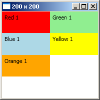
Uživatelsky specifikovaná mřížka. Na začátku musíte specifikovat sloupce a řádky které bude mřížka mít. Pak už zadáváte samotné p rvky, u každého byste měli zadat Grid.Row a Grid.Column. Čísluje se od nuly. Pokud nezadáte nic, bude se brát index 0. Opět zde platí že co je definováno níže překrývá to co je definováno výše.
<Grid>
    <!-- Using default column and row configurations -->
    <Grid.ColumnDefinitions>
        <ColumnDefinition></ColumnDefinition>
        <ColumnDefinition></ColumnDefinition>
    </Grid.ColumnDefinitions>
    <Grid.RowDefinitions>
        <RowDefinition></RowDefinition>
        <RowDefinition></RowDefinition>
        <RowDefinition></RowDefinition>
        <RowDefinition></RowDefinition>
    </Grid.RowDefinitions>
    <Label Grid.Column="0" Grid.Row="0" Background="Red">Red 1</Label>
    <Label Grid.Column="1" Grid.Row="0" Grid.RowSpan="2" Background="LightGreen">Green 1</Label>
    <Label Grid.Column="0" Grid.Row="1" Background="LightBlue">Blue 1</Label>
    <Label Grid.Column="1" Grid.Row="1" Background="Yellow">Yellow 1</Label>
    <Label Grid.Column="0" Grid.Row="2" Background="Orange">Orange 1</Label>
</Grid>
Všechny layouty zde lze pochopitelně logicky do sebe vnořovat. Obrázky a inspirace jsem zpracoval na http://www.codeproject.com/Articles/30904/WPF-Layouts-A-Visual-Quick-Start . Doufám že autor původního článku se nebude zlobit za to že jsem to přeložil do cz-cs.]]>