Hlavní Panely ve Windows 10 Universal Apps, mohou být použity kdekoliv v kódu. Pro více informací navštivte MSDN odkud jsem čerpal i já informace. Zde jsou pouze ty nejzákladnější, na MSDN to máte rozepsáno blíže.
Windows.UI.Xaml.Controls.RelativePanel
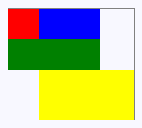
Dědí z Panel, není z ní odvozeno nic. Defines an area within which you can position and align child objects in relation to each other or the parent panel. Panel který umí jakkoliv pozicovat element ve vztahu k jiným elementům. Více napoví kód:
<RelativePanel BorderBrush="Gray" BorderThickness="1">
    <Rectangle x:Name="RedRectangle" Fill="Red" Height="44" Width="44"></Rectangle>
    <Rectangle x:Name="BlueRectangle" Fill="Blue" Height="44" Width="88" RelativePanel.RightOf="RedRectangle"></Rectangle>
    <Rectangle x:Name="GreenRectangle" Fill="Green" Height="44" RelativePanel.Below="RedRectangle" RelativePanel.AlignLeftWith="RedRectangle" RelativePanel.AlignRightWith="BlueRectangle"></Rectangle>
    <Rectangle Fill="Yellow" RelativePanel.Below="GreenRectangle" RelativePanel.AlignLeftWith="BlueRectangle" RelativePanel.AlignRightWithPanel="True" RelativePanel.AlignBottomWithPanel="True"></Rectangle>
</RelativePanel>
Windows.UI.Xaml.Controls.StackPanel
Dědí z Panel, není z ní odvozeno nic. Arranges child elements into a single line that can be oriented horizontally or vertically. Panel známý od první verze WPF – jednoduše posklada prvky do řádku nebo sloupce.
<StackPanel>
    <Rectangle Fill="Red" Height="44"></Rectangle>
    <Rectangle Fill="Blue" Height="44"></Rectangle>
    <Rectangle Fill="Green" Height="44"></Rectangle>
    <Rectangle Fill="Yellow" Height="44"></Rectangle>
</StackPanel>

Windows.UI.Xaml.Controls.Grid
Dědí z Panel, jsou z ní odvozeny SwapChainBackgroundPanel, SwapChainPanel. Defines a flexible grid area that consists of columns and rows. Child elements of the Grid are measured and arranged according to their row/column assignments (set by using Grid.Row and Grid.Column attached properties) and other logic. Controls uspořádané do tabulek, kde každý řádek a sloupeček má:
- Procentuální velikost/veškerý dostupný volný prostor
- Přesnou velikost
- Velikost akorát pro pohodlné zobrazení (
Auto)
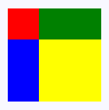
<Grid>
    <Grid.RowDefinitions>
        <RowDefinition></RowDefinition>
        <RowDefinition Height="44"></RowDefinition>
    </Grid.RowDefinitions>
    <Grid.ColumnDefinitions>
        <ColumnDefinition Width="Auto"></ColumnDefinition>
        <ColumnDefinition></ColumnDefinition>
    </Grid.ColumnDefinitions>
    <Rectangle Fill="Red" Width="44"></Rectangle>
    <Rectangle Fill="Blue" Grid.Row="1"></Rectangle>
    <Rectangle Fill="Green" Grid.Column="1"></Rectangle>
    <Rectangle Fill="Yellow" Grid.Row="1" Grid.Column="1"></Rectangle>
</Grid>

Windows.UI.Xaml.Controls.VariableSizedWrapGrid
Dědí z Panel, není z ní odvozeno nic. Provides a grid-style layout panel where each tile/cell can be variable size based on content. Její klíčová vlastnost je MaximumRowsOrColumns. Dejme tomu že máme ji nastavenou na 2 a vložíme 5 prvků. V prvním řádku budou 2, v druhém 2 a ve třetím 1. Pokud některý prvek vezme více prostoru do šířky/výšky, budou mít stejný dostupný prostor i ostatní prvky ve sloupci/řádku. Je tedy podobná Grid, s tím rozdílem, že šířka a výška je vždy „Auto„. Přednost má ale uspořádání do mřížky, to znamená že primárně se snaží zaplnit všechny buňky tabulek. Proto nemusí vždy být počet řádků/sloupců takový jaký jste specifikovali.
<VariableSizedWrapGrid MaximumRowsOrColumns="3" ItemHeight="44" ItemWidth="44">
    <Rectangle Fill="Red"></Rectangle>
    <Rectangle Fill="Blue" VariableSizedWrapGrid.RowSpan="2"></Rectangle>
    <Rectangle Fill="Green" VariableSizedWrapGrid.ColumnSpan="2"></Rectangle>
    <Rectangle Fill="Yellow" VariableSizedWrapGrid.RowSpan="2" VariableSizedWrapGrid.ColumnSpan="2"></Rectangle>
</VariableSizedWrapGrid>
Windows.UI.Xaml.Controls.Canvas
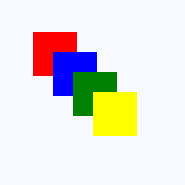
Dědí z Panel, je z ní odvozeno LoopingSelectorPanel, PivotHeaderPanel. Defines an area within which you can explicitly position child objects, using coordinates that are relative to the Canvas area. Další Panel control který nestárne. Zobrazuje prvky na souřadnicích relativně k jeho bodu 0,0. Mohou se různě překrývat a mít nastavený různý z-index.
<Canvas Width="120" Height="120">
    <Rectangle Fill="Red" Height="44" Width="44"></Rectangle>
    <Rectangle Fill="Blue" Height="44" Width="44" Canvas.Left="20" Canvas.Top="20"></Rectangle>
    <Rectangle Fill="Green" Height="44" Width="44" Canvas.Left="40" Canvas.Top="40"></Rectangle>
    <Rectangle Fill="Yellow" Height="44" Width="44" Canvas.Left="60" Canvas.Top="60"></Rectangle>
</Canvas>
Můžou být použity pouze v šabloně ItemsControl:
Windows.UI.Xaml.Controls.ItemsStackPanel
Dědí z Panel, třída je sealed. Arranges child elements into a single line that can be oriented horizontally or vertically. Supports pixel-based UI virtualization and grouped layouts. Can only be used to display items in an ItemsControl that shows multiple items; not supported for ComboBox and FlipView. Podobný jako VirtualizingStackPanel, hodí se pro menší množství položek. Třída začíná „Items„, to znamená že obsah není virtualizovaný, jako u tříd začínající na „Virtualized„.
Windows.UI.Xaml.Controls.ItemsWrapGrid
Dědí z Panel, třída je sealed. Positions child elements sequentially from left to right or top to bottom. When elements extend beyond the container edge, elements are positioned in the next row or column. Supports pixel-based UI virtualization and grouped layouts. Can only be used to display items in an ItemsControl that shows multiple items; not supported for ComboBox and FlipView.
Windows.UI.Xaml.Controls.VirtualizingStackPanel
Dědí z OrientedVirtualizingPanel, třída je sealed. Arranges and virtualizes content on a single line that is oriented either horizontally or vertically. Can only be used to display items in an ItemsControl. Hodí se když máte control s vlastností ItemsPanel který zároveň zobrazuje velké množství položek – tyto položky pak při zmizení z obrazovky se nelikvidují ale pouze se změní jejich obsah, což je výrazně rychlejší a úspornější.
Windows.UI.Xaml.Controls.WrapGrid
Dědí z OrientedVirtualizingPanel, třída je sealed. Positions child elements sequentially from left to right or top to bottom. When elements extend beyond the container edge, elements are positioned in the next row or column. Can only be used to display items in an ItemsControl. Používat pro prvky ComboBox a FlipView, protože třída ItemsWrapGrid je nepodporuje.
Pro použití v kódu XAML pro vytvoření zcela nového prvku z Panel
Windows.UI.Xaml.Controls.Primitives.CalendarPanel
Dědí z Panel, třída je sealed. Represents a panel that contains a calendar. Jak již dokumentace vývojářů MS napovídá, jedná se o panel, který jen říká, že obsahuje kalendář. Veškerý kód je ale už na vás – celý kalendář si musíte vybudovat na zelené louce.
DirectX panely
Windows.UI.Xaml.Controls.SwapChainBackgroundPanel
Dědí z Grid, není z ní odvozeno nic. Implements a XAML layout surface target for Microsoft DirectX interoperation scenarios.
Windows.UI.Xaml.Controls.SwapChainPanel
Dědí z Grid, není z ní odvozeno nic. Provides a hosting surface, where Microsoft DirectX swap chains provide content that can be rendered into a XAML UI. A SwapChainPanel element is a key component for an app that renders Microsoft DirectX graphics and then presents those visuals within a XAML page.
Bázové třídy pro jiné Panely
Windows.UI.Xaml.Controls.VirtualizingPanel
Dědí z VirtualizingPanel, jsou z ní odvozeny CarouselPanel, OrientedVirtualizingPanel. Provides a framework for Panel elements that virtualize their visual children.
Windows.UI.Xaml.Controls.Primitives.OrientedVirtualizingPanel
Dědí z VirtualizingPanel, jsou z ní odvozeny VirtualizingStackPanel, WrapGrid. Adds infrastructure (provides base class) for virtualizing layout containers that support spatial cues, such as VirtualizingStackPanel and WrapGrid.
Pro použití pouze se specifickými prvky
Windows.UI.Xaml.Controls.Primitives.CarouselPanel
Dědí z Panel, není z ní odvozeno nic. Represents a panel that arranges its items in a line and circles around to the first item when the last item is reached. MSDN dále píše:
CarouselPanel can’t be used as a stand-alone control, it can only be used as the
ItemsControl . It’s the default ItemsPanel for the
ComboBox control, and is not supported for use with any other ItemsControl . Což znamená že CarouselPanel lze použít jen jako panel template pouze v ComboBoxu. U všeho ostatního vyhodí app výjimku „The Panel you are using for the Control is not allowed as an ItemsPanel for the Control.“
Windows.UI.Xaml.Controls.Primitives.LoopingSelectorPanel
Dědí z Panel, třída je sealed. A panel for positioning and arranging child LoopingSelector elements. LoopingSelector je třída která dává schopnost aplikace zobrazit seznam položek který nikdy nekončí – při dosažení poslední položky se plynule přejde na první položku.
Windows.UI.Xaml.Controls.Primitives.PivotHeaderPanel
Dědí z Canvas, třída je sealed. Displays the header text of the items in a Pivot control. Zajišťuje zobrazení textu záložky v control Pivot.
Windows.UI.Xaml.Controls.Primitives.PivotPanel
Dědí z Panel, třída je sealed. Displays the items in a Pivot control. Zobrazuje obsah záložky v control Pivot.